 Case Study
HelloFresh Extras
Increasing adoption of a new product category without disrupting the core customer journey.
within a quarter
across the journey
fully preserved
A growth category that wasn't growing.
HelloFresh was exploring ways to increase average order value beyond its core meal-kit offering. Extras — a category of add-ons like desserts and fruit — had already launched in the Netherlands and Belgium, but adoption remained below expectations.
I joined the initiative to understand why customers weren't engaging with Extras and to identify opportunities to improve performance without impacting the meal-selection experience.
Grow the category without disrupting the core journey.
Customers showed clear interest in complementary products, particularly healthier options like fruit. The challenge was growing Extras without disrupting one of HelloFresh's most important journeys — meal selection.
Success depended on balancing two goals at once:
- Increase awareness and adoption of Extras
- Protect meal-selection conversion and weekly-order completion
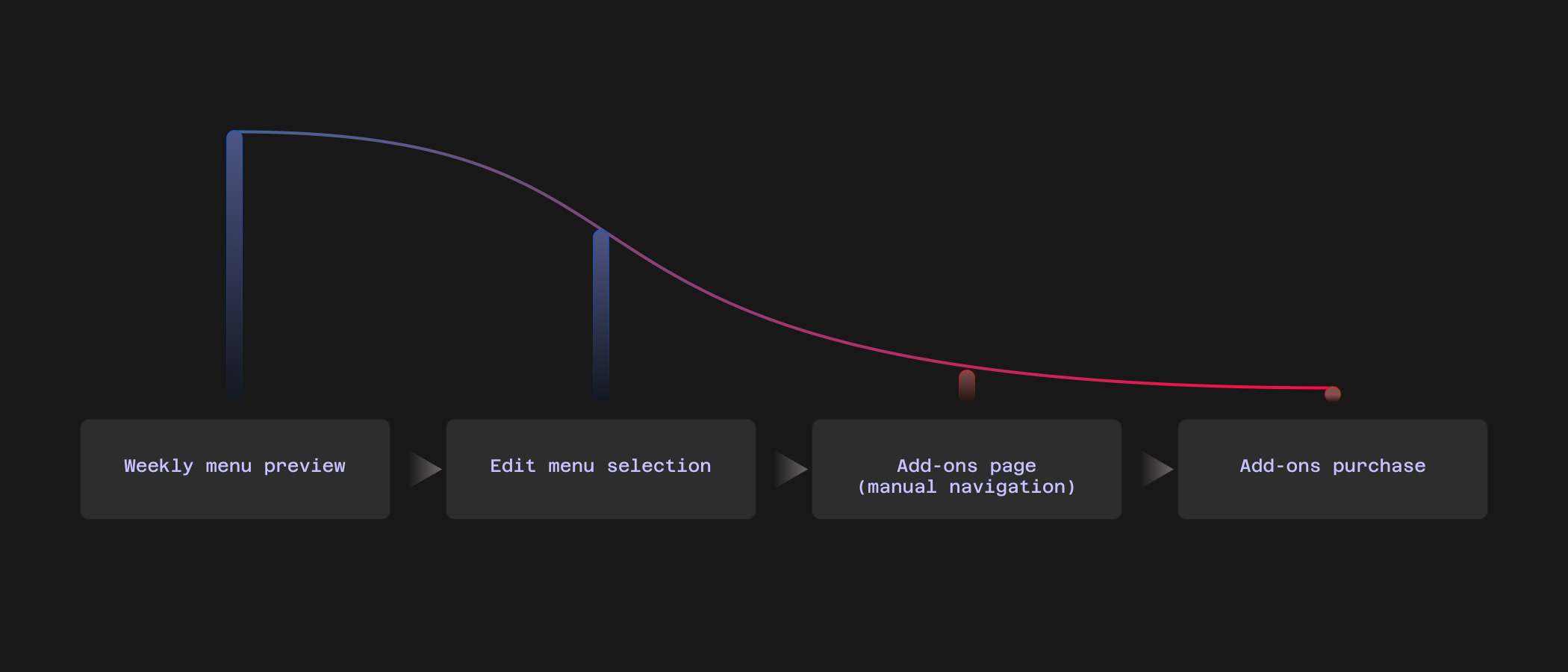
IA / flow diagram — where Extras sits in the customer journey
Existing information architecture showing the complexity Extras had to fit within
Two blockers, not one.
I audited the experience, reviewed behavioural data and marketing research, and advocated for usability testing. Working with a UX Researcher, we ran customer sessions in the Netherlands and combined those findings with analytics and market insights.
01
Discovery was the primary issue
Extras were only available in Edit Mode — a state many customers never entered. If they never edited their meal plan, they never saw Extras existed.
02
Customers lacked confidence
Those who did discover Extras were often unsure whether products were included in their subscription, whether purchases were recurring, and when changes would affect deliveries.

Usability testing — sessions in the Netherlands, Extras hidden in Edit Mode
Usability testing summary and screenshots showing Extras buried below the primary flow
Frictionless discovery — the guiding principle.
Rather than asking customers to seek out Extras, we surfaced the category at moments where they were already engaged, and reduced the effort required to purchase.
Increase visibility in Preview Mode
Many customers accepted the default meal selections and never entered Edit Mode — meaning they never discovered Extras existed.
To increase exposure, I introduced a dedicated Extras card directly within Preview Mode. The card was visually distinct from meal cards, smaller in height to minimise disruption, and positioned prominently to increase awareness.
This area sits within a critical business journey — stakeholders were understandably cautious about introducing new content this high in the experience. We validated the concept through experimentation before committing.
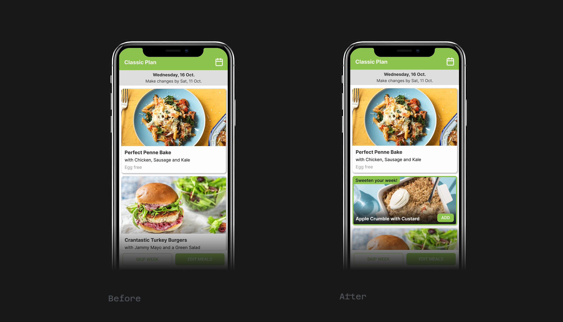
Before / after — Preview Mode
Extras card introduced directly within Preview Mode — no Edit Mode required
Validate through experimentation
We tested two approaches to evaluate the trade-off between discoverability and friction.
- Extras visible in Preview Mode
- Purchase required entering Edit Mode
- Extras visible in Preview Mode
- Direct purchase from Preview Mode
Create a dedicated discovery moment
We introduced Extras immediately after menu selection — creating a focused opportunity for exploration once the customer's primary task was complete.
Alongside the discovery improvements, we refined messaging and interactions to clarify subscription behaviour, delivery timing, and purchase consequences.
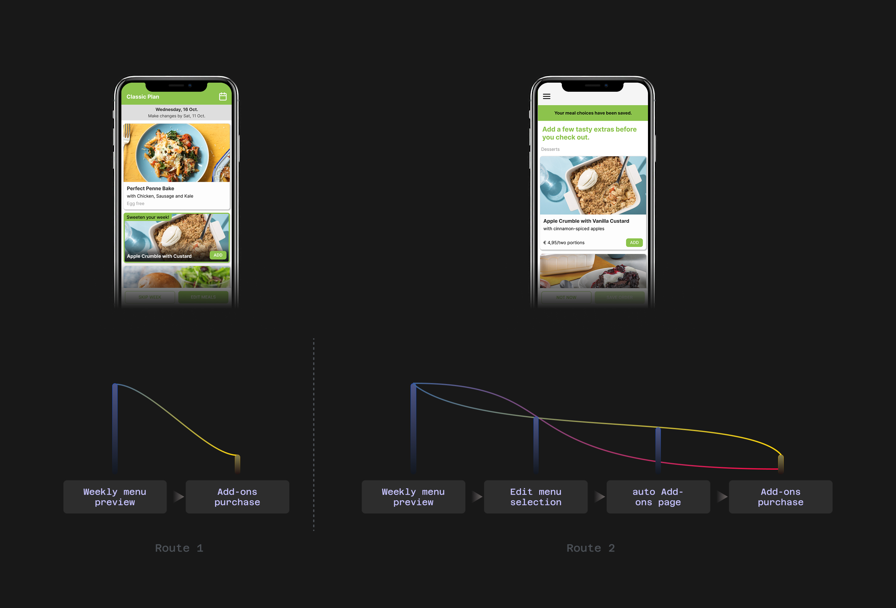
Redesigned funnel — post-menu-selection discovery moment
Confirmation and CTA clarity screens — subscription, timing, and purchase behaviour made explicit
Discoverability and clarity — not demand — were the blockers.
The redesign significantly improved engagement across the Extras journey:
- Tripled Extras uptake within a quarter
- Increased product visibility and engagement
- Improved customer understanding and confidence
- Preserved weekly-order behaviour
Extras Uptake
2.6%
Before
8.2%
After
↑ 3×
Growth
Validate assumptions before designing solutions.
Customers were interested in the proposition, but many never encountered it — while others lacked confidence in how it worked. Solving those two problems had a far greater impact than introducing new features. The most valuable lesson: test what's actually blocking adoption before building more.
Audited the existing experience and behavioural data
Advocated for and co-ran usability testing with a UX Researcher
Combined qualitative findings with analytics and market research
Designed the Preview Mode Extras card and discovery moment
Defined and ran the A/B experiment across two variants
Refined messaging around subscription and delivery clarity
Worked cross-functionally with Product, Engineering, Data, and local Marketing
Established a scalable model for future add-on categories