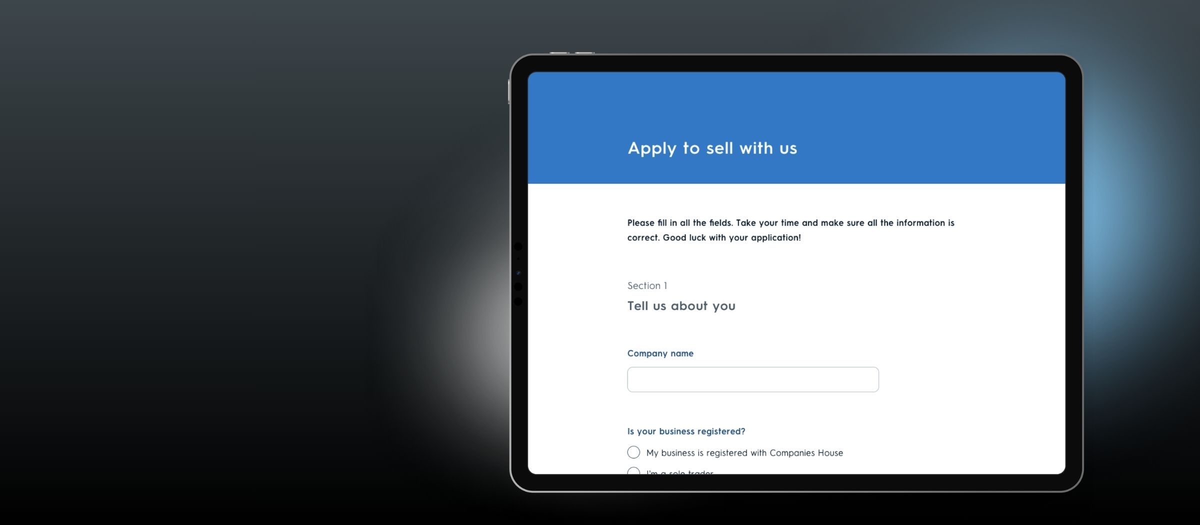
 Case Study
Scaling Seller Acquisition Without Losing the Curation
Streamlining seller onboarding for a curated marketplace — helping Notonthehighstreet grow its seller base without compromising the human judgement at the heart of its curation model.
to reach a decision
made in one review
preserved intact
A curated marketplace, slowed by its own vetting process.
Not On The High Street is a curated marketplace — bringing new sellers onboard involves a human vetting process. But that process had become slow and labour-intensive: it took 37 days on average for a new seller to start selling, with around 25 days spent reaching the initial selection decision.
The New Partner Acquisition (NEPA) team wanted to reduce this time and explore where parts of the process could be automated. The challenge: they weren't yet sure what should be automated.
I co-led the project end-to-end with a UX Researcher, from discovery through concept development, validation and delivery — working closely with Product and NEPA, with direction from Design and Product leadership.
Understanding where the time was actually going.
Rather than start by looking for something to automate, we first needed to understand where time was actually being spent. This area had received little product attention, so there was limited quantitative data to work from.
Working with a UX Researcher, we built understanding through interviews with recently accepted sellers, interviews with NEPA team members across roles and seniority, job shadowing curators during the vetting process, and mapping the end-to-end selection workflow.
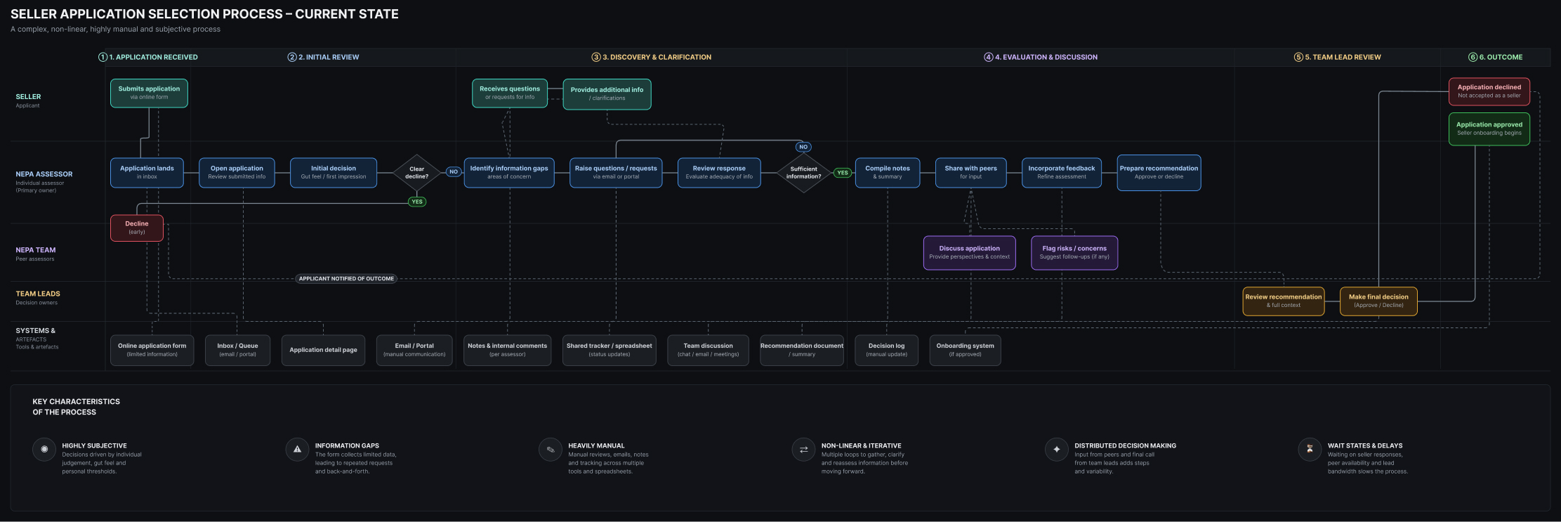
Current state diagram — the back-and-forth loop
Application → Reviews → Information requests → Reviews → Decision — with back-and-forth highlighted
What we learned
The selection process was almost entirely manual. Applications were reviewed multiple times by different people, with highly subjective criteria and frequent requests for additional information. The application form itself was a major contributor — it captured very little of the information curators needed to make a decision, creating considerable back-and-forth with applicants.
01
Brand and presentation mattered as much as product
A seller's brand and how they presented their products mattered alongside product quality itself — something the existing form didn't ask about.
02
Sellers expected a rigorous process
Sellers saw being accepted by NOTHS as a significant milestone, and expected the selection process to be genuinely rigorous.
03
Expectations weren't always aligned
Applicants often researched NOTHS before applying, but some were surprised by fees and commission later in the process.
"The opportunity wasn't necessarily to automate curation. It was to give curators better information upfront."
Two reasons the application stood out.
We identified several opportunities across the journey — improving communication, internal review and decision-making, and making applications easier for prospective sellers. We prioritised these with the NEPA and Product teams.
It was where most of the decision-making time was being spent.
The existing form barely captured the information required for assessment.
Improving the quality of information entering the process could reduce downstream clarification — while leaving the actual curation decision in human hands.
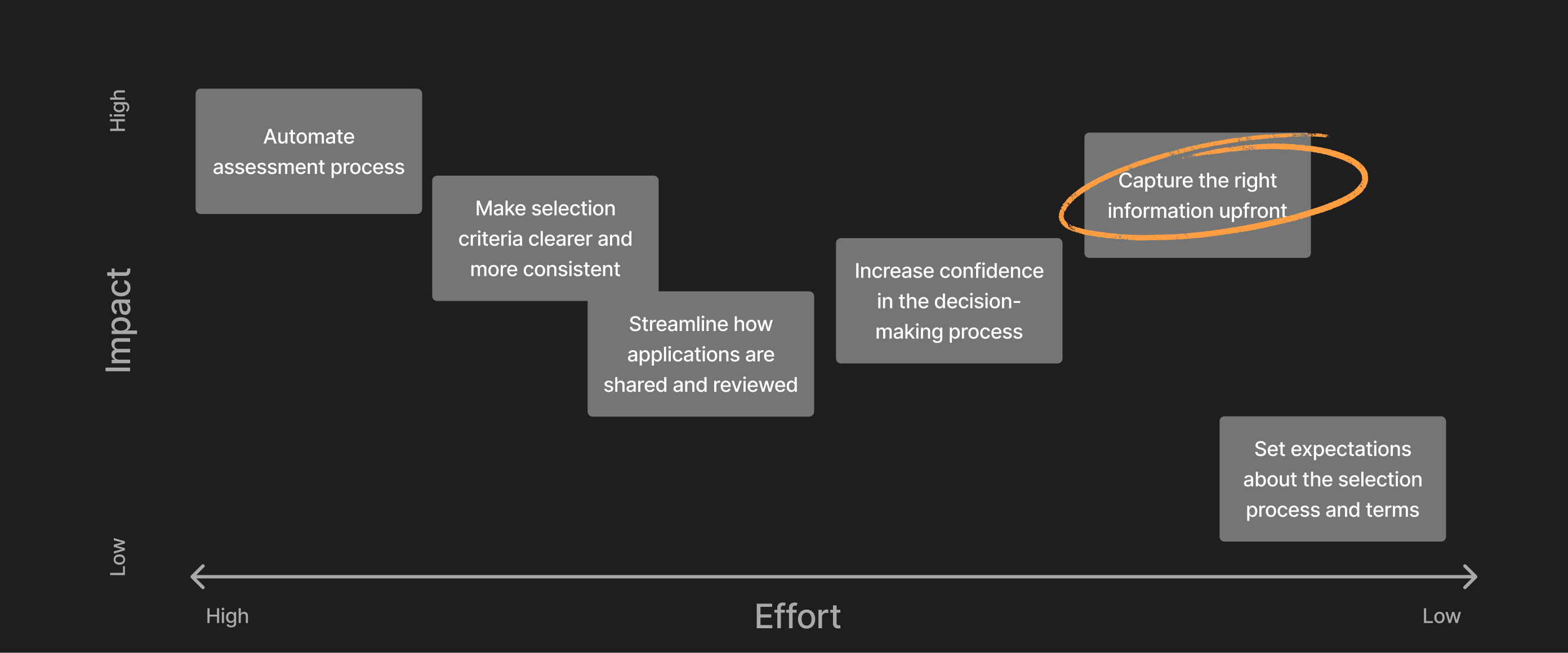
Opportunity map — prioritisation matrix
Opportunities prioritised with NEPA and Product — the application form highlighted as the point of intervention
More information — without a heavier form.
We believed richer information upfront would reduce back-and-forth and help NEPA reach decisions faster. The challenge was to gather more information without creating a more burdensome application.
If we collect more relevant information about a seller, their business and their products at the point of application, we can reduce the information gaps that slow down assessment.
Working hypothesisTurning tacit knowledge into questions
We ran a working session with UX, Research, Product and NEPA, combining what we'd learned from shadowing with the team's own knowledge of the selection process. We mapped the information needed against two dimensions — Criticality × Objectivity/Subjectivity — which surfaced the biggest gap: critical information that was subjective and difficult for curators to infer from the existing application.
We translated those gaps into questions about the seller's business, brand and products — designing the form to help applicants present their strongest products and make the case for their business, rather than simply demanding more data. The form also surfaced useful information back to sellers, including commercial terms and requirements like licensing and certifications.
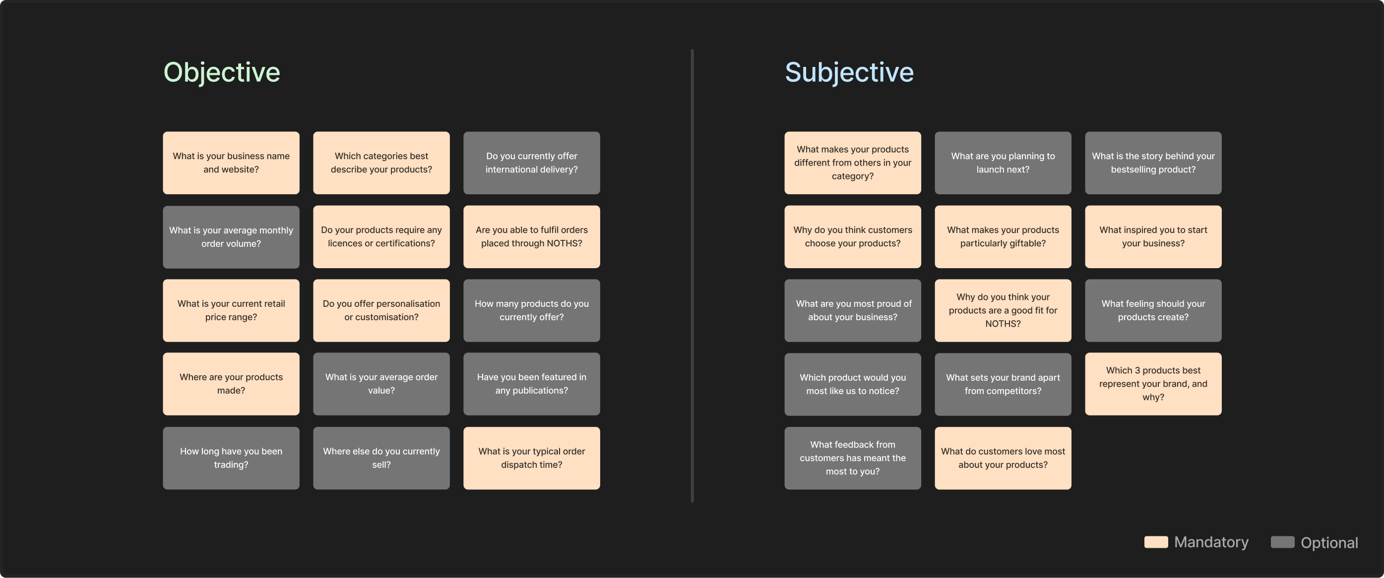
Criticality × Objectivity/Subjectivity framework
The framework used to identify information gaps, followed by example questions from the final form
Before investing heavily in the new experience, we tested whether applicants could actually provide the richer information we were asking for.
Quick prototype — Google Forms
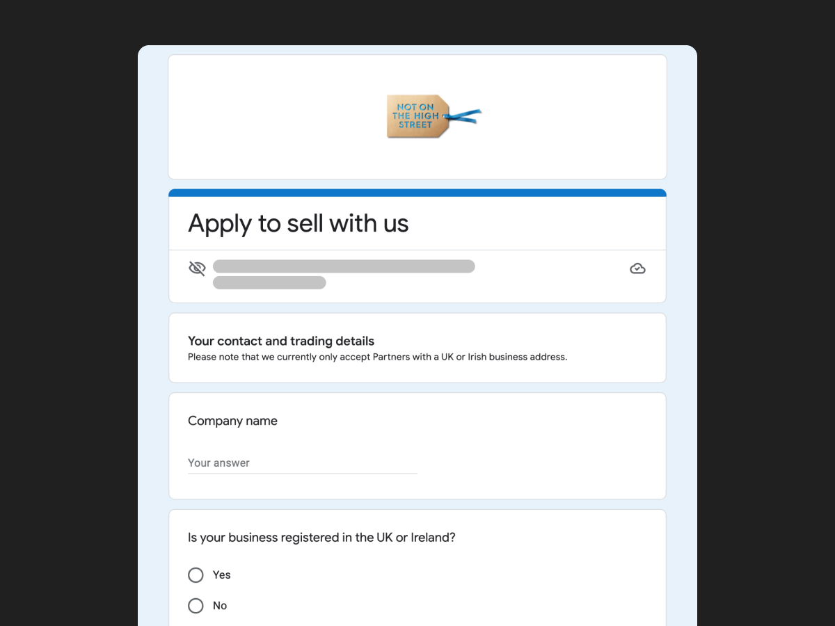
Google Form prototype
The quick prototype tested with five recently onboarded sellers
I built the proposed form in Google Forms and tested it with five recently onboarded sellers — could they understand the questions, find the required information, and did the volume feel overwhelming?
Largely positive. Sellers accessed product information easily and understood requirements like licensing and certification. We found some repetition across product questions, and more personal or emotive questions were harder to articulate — refined accordingly.
Live pilot — in the real process
For two weeks, around 25% of applications (~100) were randomly selected and asked to complete the new application alongside the existing control group.
The new approach showed a reduction in processing time and back-and-forth — enough confidence to invest in the full experience.
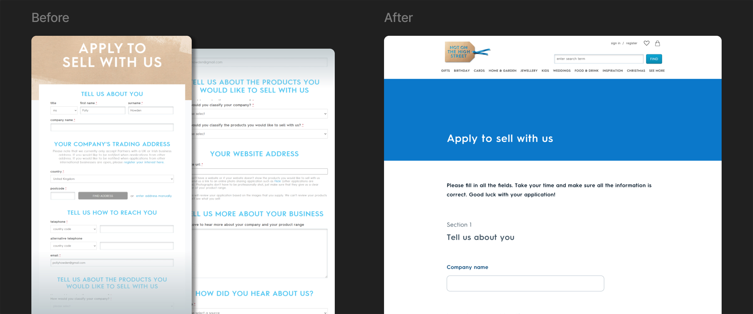
Experiment diagram — existing vs new form, cohort comparison
Pilot structure: existing form vs new form, split across two cohorts, compared on decision time
Refined, tested again, then rolled out.
With evidence the approach worked, I moved into detailed design — refining questions from the pilot, designing the high-fidelity experience, and running another round of usability testing focused on interaction and content.
The interaction itself tested well. The main remaining issue was that some questions needed additional context — deferred to a subsequent iteration rather than delaying the release.
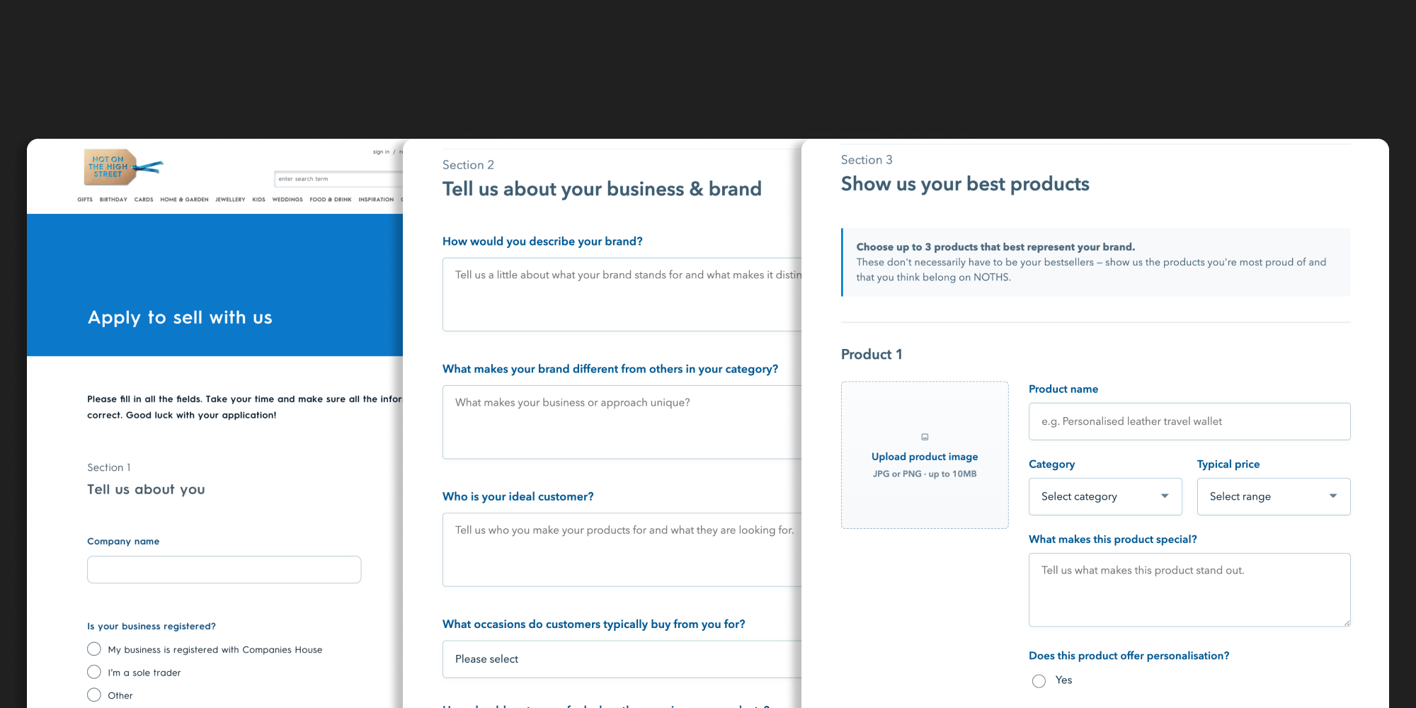
Business & brand questions, and product presentation screens
The final high-fidelity experience — business & brand questions alongside product presentation
Automation wasn't the answer. Better information was.
The redesigned application helped the acquisition team make decisions faster without removing the human judgement at the heart of NOTHS's curation model — a 25% reduction in time to decision, and a 40% uplift in decisions made in one review.
More importantly, the project demonstrated that the answer to a request for "automation" wasn't necessarily automation itself. By understanding the underlying workflow, we found a simpler intervention: improve the quality of information entering the process, reduce avoidable manual work, and preserve human judgement where it mattered.
Good product design doesn't always mean building what was initially requested. The most valuable contribution here was helping the team move from a vague desire to "automate something" to a clearly understood problem, testable hypothesis and measurable outcome.
Co-led the project end-to-end with a UX Researcher
Led discovery — interviews, job shadowing, and workflow mapping
Synthesised research into a clear opportunity area
Facilitated the cross-functional working session and framework
Designed and ran the Google Forms prototype test
Designed and coordinated the live pilot experiment
Designed the high-fidelity application experience
Ran usability testing on interaction and content
Worked closely with Product, NEPA, and Design/Product leadership