 Case Study
Emergency Response Module
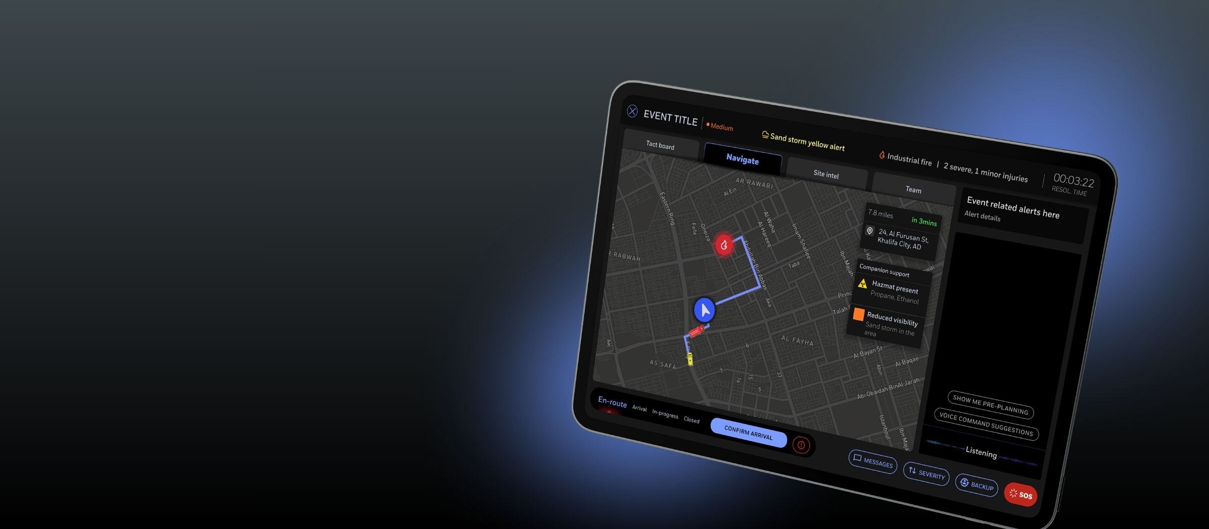
0→1 design of a companion app for emergency responders — a native extension of Smart City Suite, improving situational awareness, response coordination and decision-making under high-stress, time-critical conditions.
underway
customer site
emergency positioning
A commonly sought-after integration — missing from the offering.
The Smart City Suite is a city-scale IoT platform used in command centres to monitor urban services — waste, irrigation, street lighting, and more. While it positioned itself as a unified city operations layer, it lacked emergency response capability.
Emergency services continued to operate on separate systems, limiting visibility, coordination, and use of city data during incidents. This gap surfaced repeatedly through customer conversations, RFPs, and ongoing deployments.
Design the module as a native extension — not a bolt-on.
An existing customer was actively exploring a centralised emergency response solution. The UX function, led by me, partnered with them to co-develop and pilot the module in a live city environment — ensuring the solution was productised rather than bespoke.
The goal: close a known gap in the suite while expanding it into safety-critical city operations.
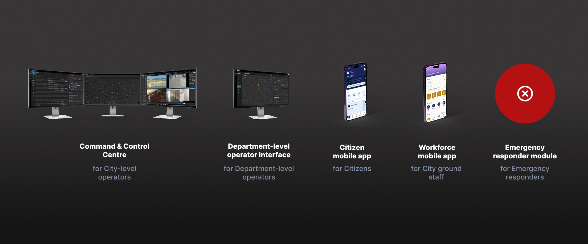
Smart City Suite ecosystem — five surfaces, one platform
The Emergency Responder module as the fifth surface in the Smart City Suite
A two-part solution, tightly integrated with the Smart City offering.
Designed to fit naturally within the existing architecture, differentiate from standalone emergency systems, and solve real field problems.
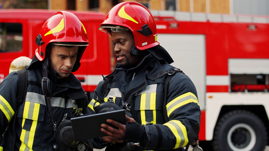
Emergency Responder App
Emergency Responder App
- Incident context and navigation
- Real-time situational awareness
- Communication with dispatch

Dispatcher Interface — Command Centre
Dispatcher Interface
- Incident intake and triage
- Resource assignment and tracking
- Live coordination with responders
Structured sessions across the full stakeholder ecosystem.
I planned and facilitated discovery sessions with product, engineering, SMEs, and customer stakeholders — spanning domain understanding through value proposition definition.
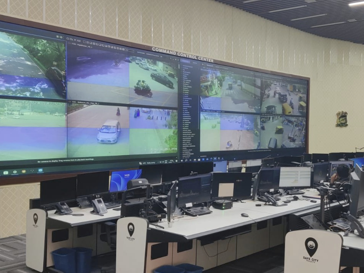
Field study — live dispatcher environment
Field studies: studied live dispatcher environments and command centres
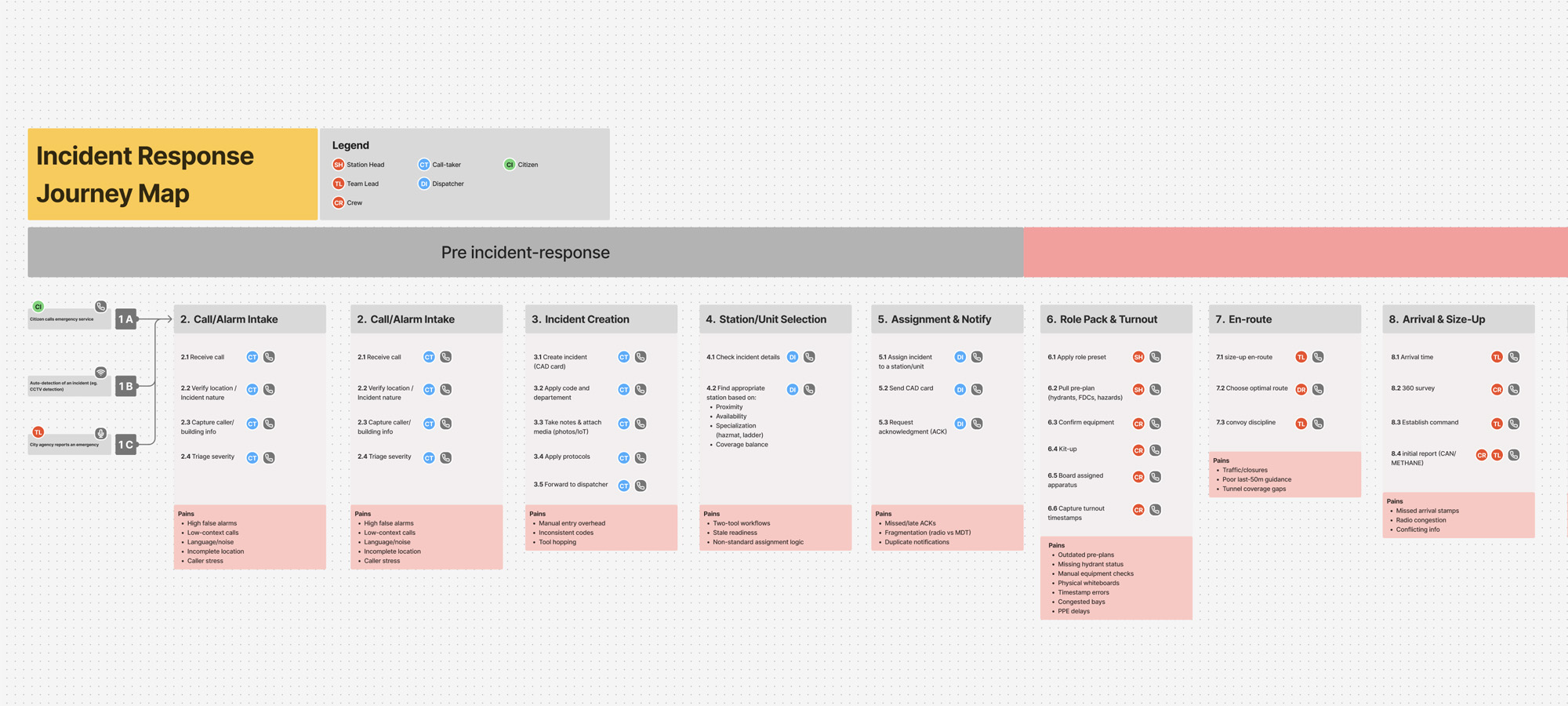
Journey mapping — pre-incident response workflow across all stakeholders
Journey mapping: full pre-incident response flow across civilian, call centre, dispatcher, and responder
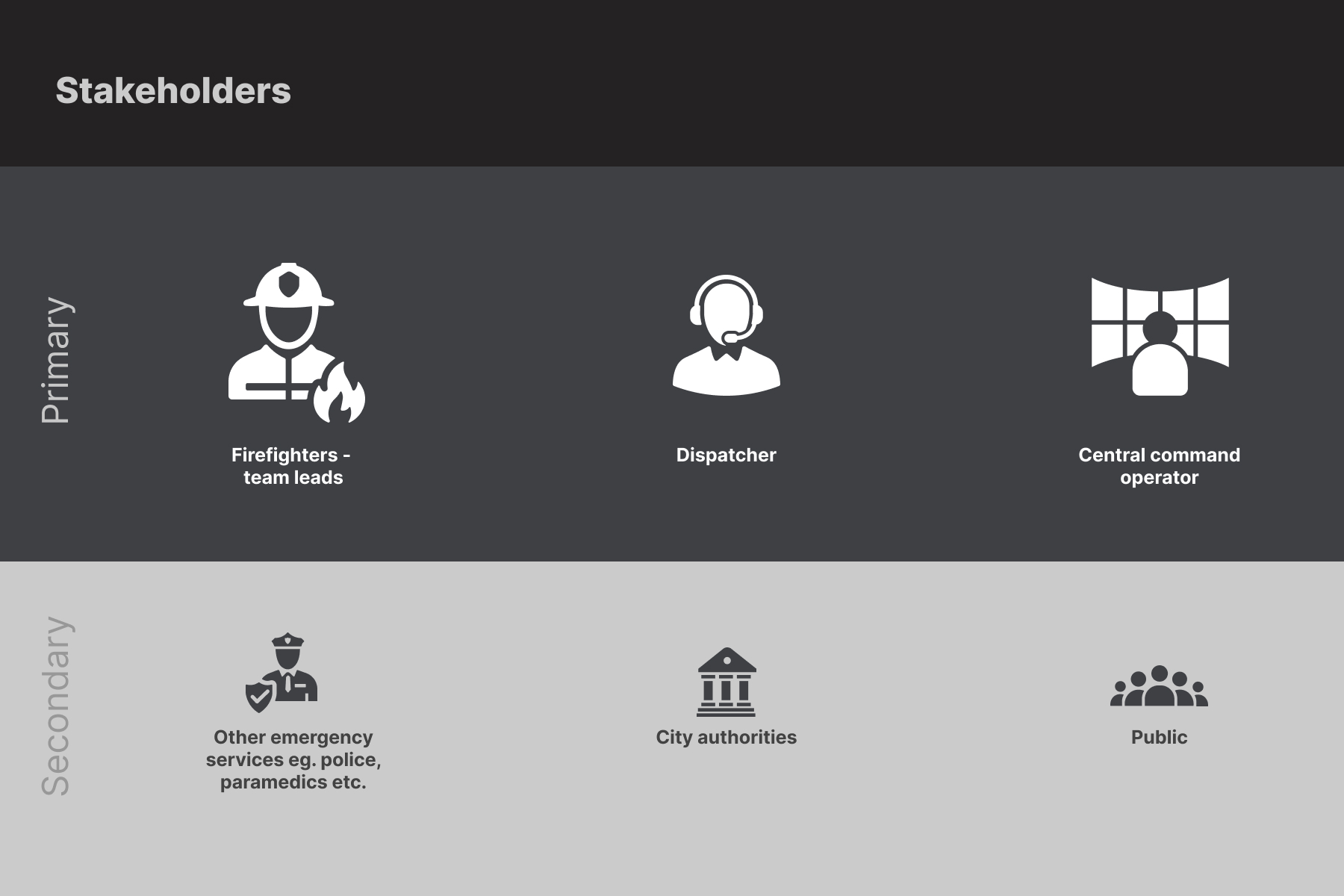
Stakeholder map artefact
Primary: firefighters, dispatchers, central command · Secondary: other emergency services, city authorities, public
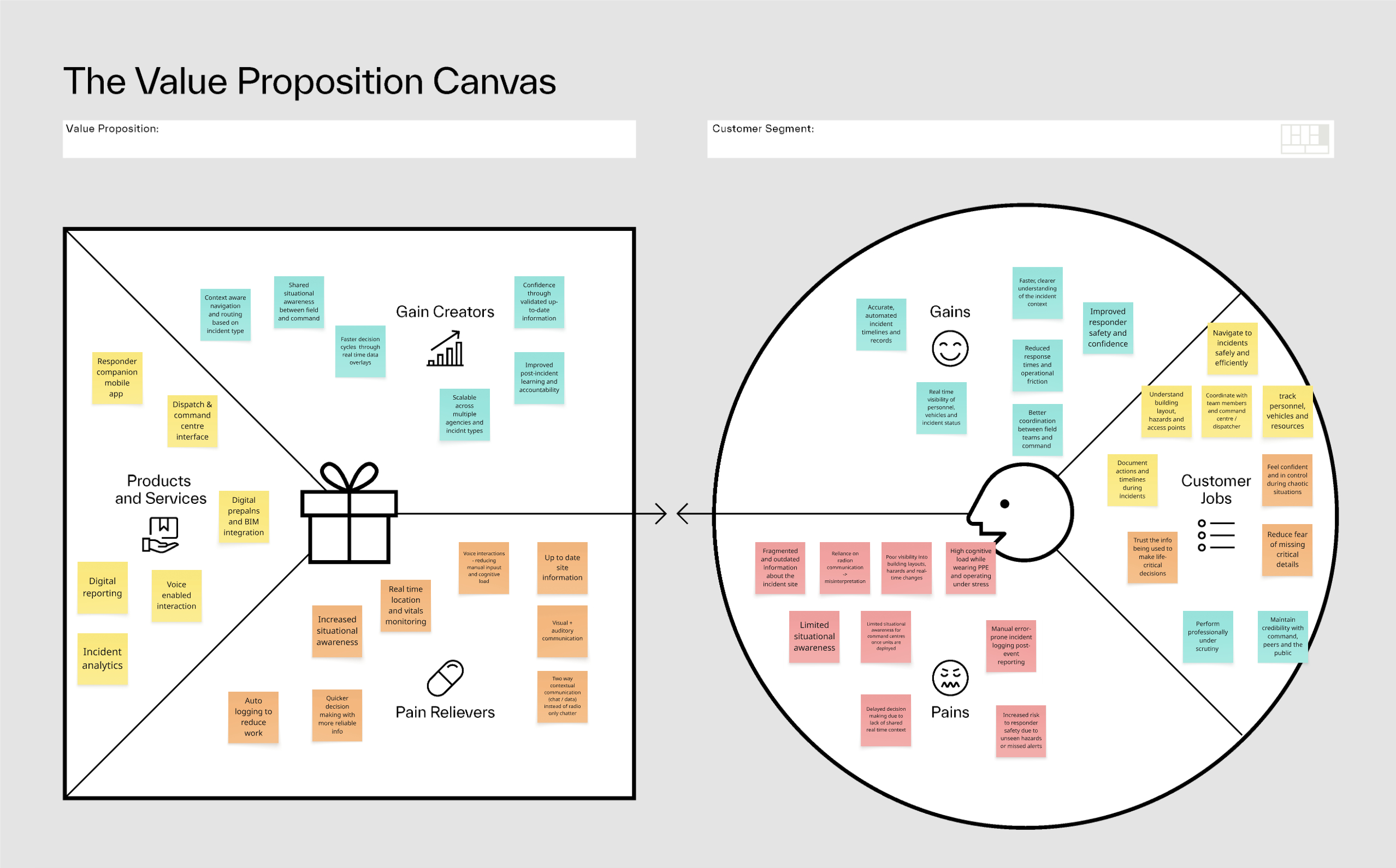
Value Proposition Canvas
Customer jobs, pains, and gains mapped across both user types
Rapid prototyping — validated through field feedback.
User story definition across responder and dispatcher journeys, continuous SME collaboration, iterative refinement from usability testing in the field.
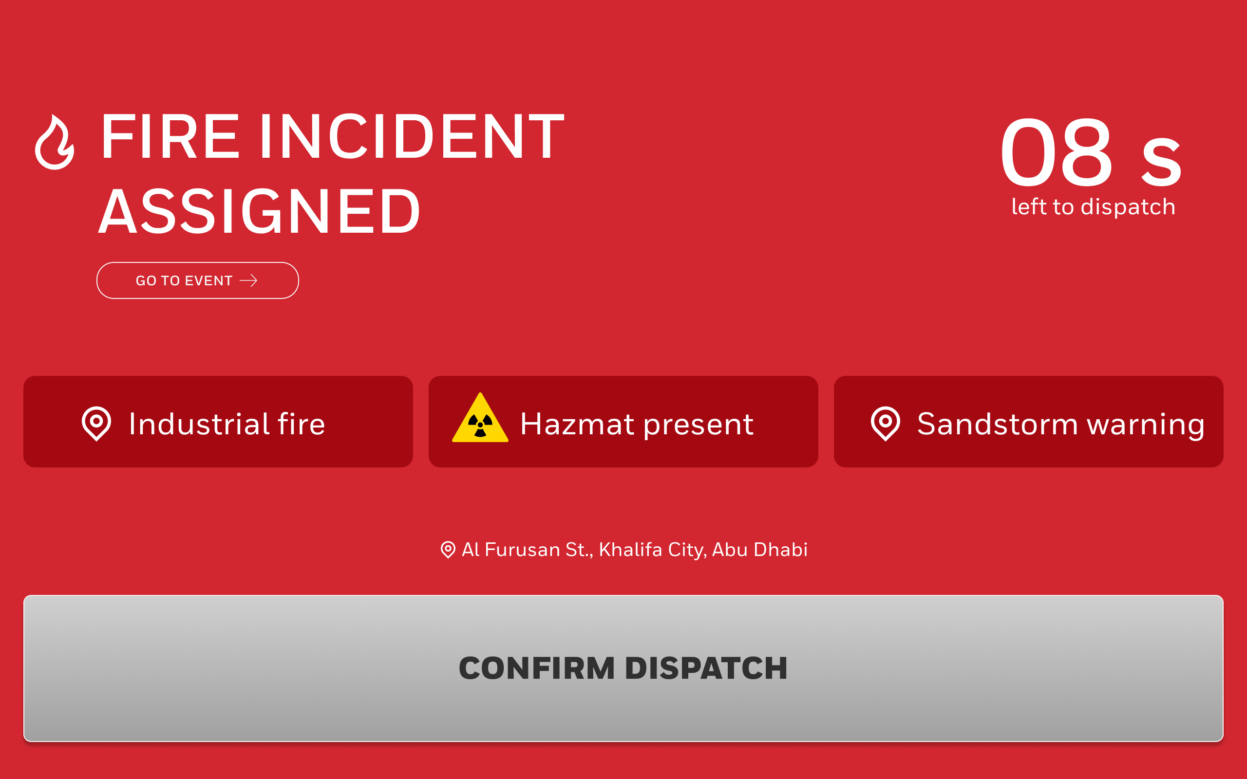
Field-resistant interactionsLarge targets, maximum contrast, glove-friendly.
Situational awareness firstMap and context always visible during resolution.
Reduced cognitive loadCurated, contextual — surface what's needed, nothing more.
Decisions over featuresReducing tool-switching beat adding capability.
Testing with real dispatchers and responders — in the field.
Usability testing insights directly shaped layouts, flows, and interaction patterns. Key learnings shifted the product's fundamental scope.
Information had to be contextual and prioritised — not exhaustive
Responders needed glanceable confidence-building cues
Reducing tool-switching delivered more value than adding features
Information had to be curated — BIM docs and pre-planning surfaced on request, not by default
App focus shifted to briefing, planning, and reporting — intentionally reducing scope from active incident-response phase
Designed for the field — speed, clarity, zero friction.
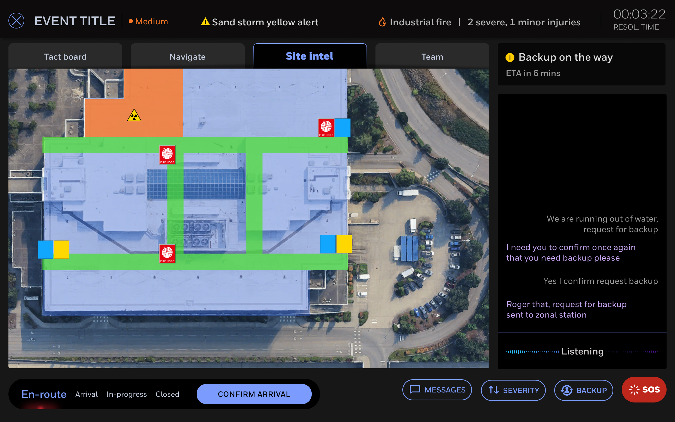
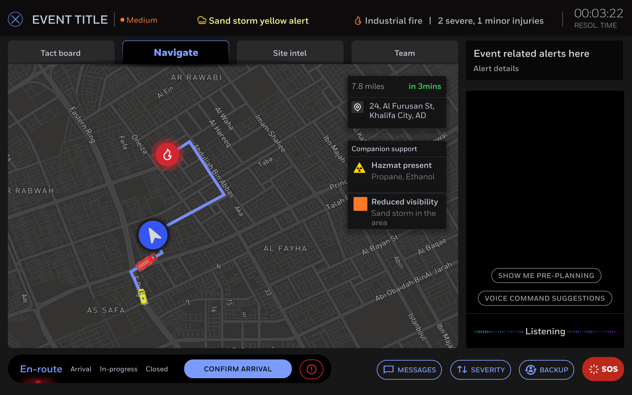
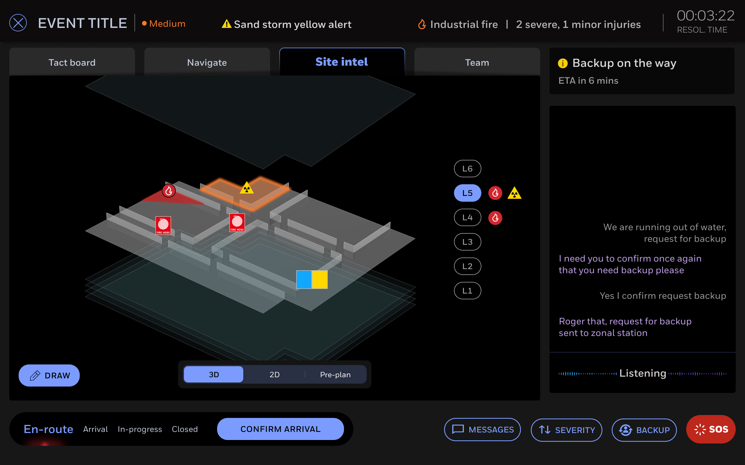
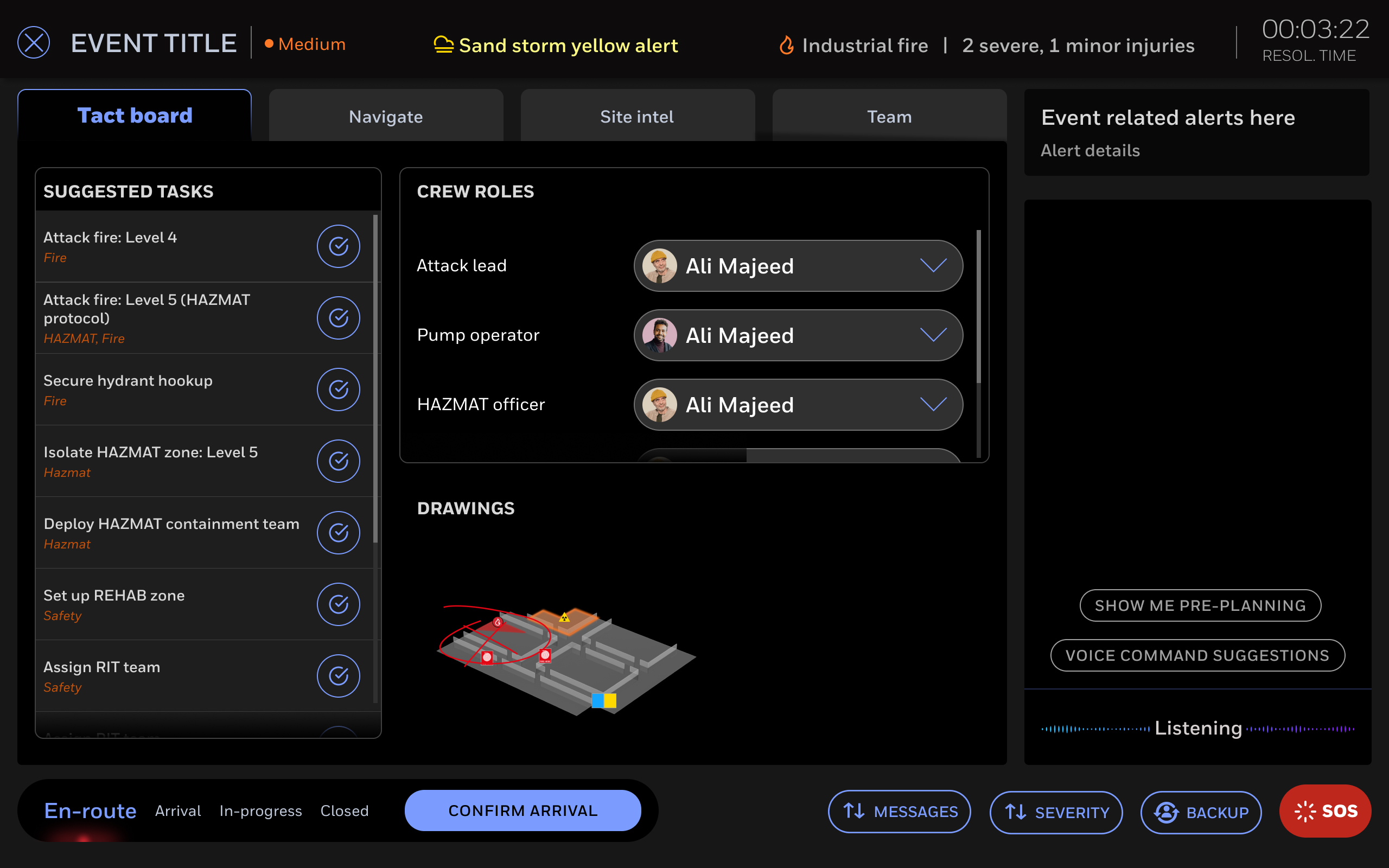

Led the UX team through full 0→1 delivery
Planned and facilitated structured discovery sessions
Researched first responder environments and constraints
Defined design principles and value proposition
Led user story definition across both journeys
Rapid prototyping and storyboarding
Conducted usability testing in the field
Stakeholder management across product, engineering, sales
Identified device, hardware, and PPE interaction constraints