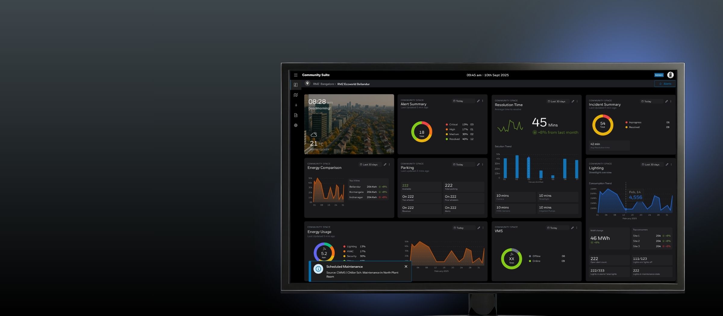
 Case Study
Smart Communities Platform
0→1 design of a platform that acts as a system of systems for large mixed-use spaces and campuses — making mission-critical operations manageable at estate scale.
incidents (MTTR)
monitored systems
on the back of the platform
A category mismatch, not a feature gap.
Mixed-use community operators weren't running broken technology. Most sites already had functional subsystems — BMS, SCADA, VMS, access control, street lighting, irrigation. The problem was structural: these systems operated entirely independently.
There was no unified operational picture. Connecting the dots during an incident was entirely manual. And the teams doing this work were leaner and more generalist than the enterprise tools assumed — designed for multi-screen command centres, they were a cognitive liability in this context.
The existing City Suite had 60+ deployments but this segment needed something different: mission-critical operations at estate scale, without city-scale complexity or cost.
"When something goes wrong in Zone C, I'm switching between three systems just to understand what's happening. By the time I've pieced it together, ten minutes are gone."
— Operations Supervisor, field interviewThree findings that shaped the direction.
Research combined user interviews, field visits to prospect sites, RFP analysis, and competitive review. Three findings directly shaped the design direction — and in two cases, resolved internal disagreements about product architecture.
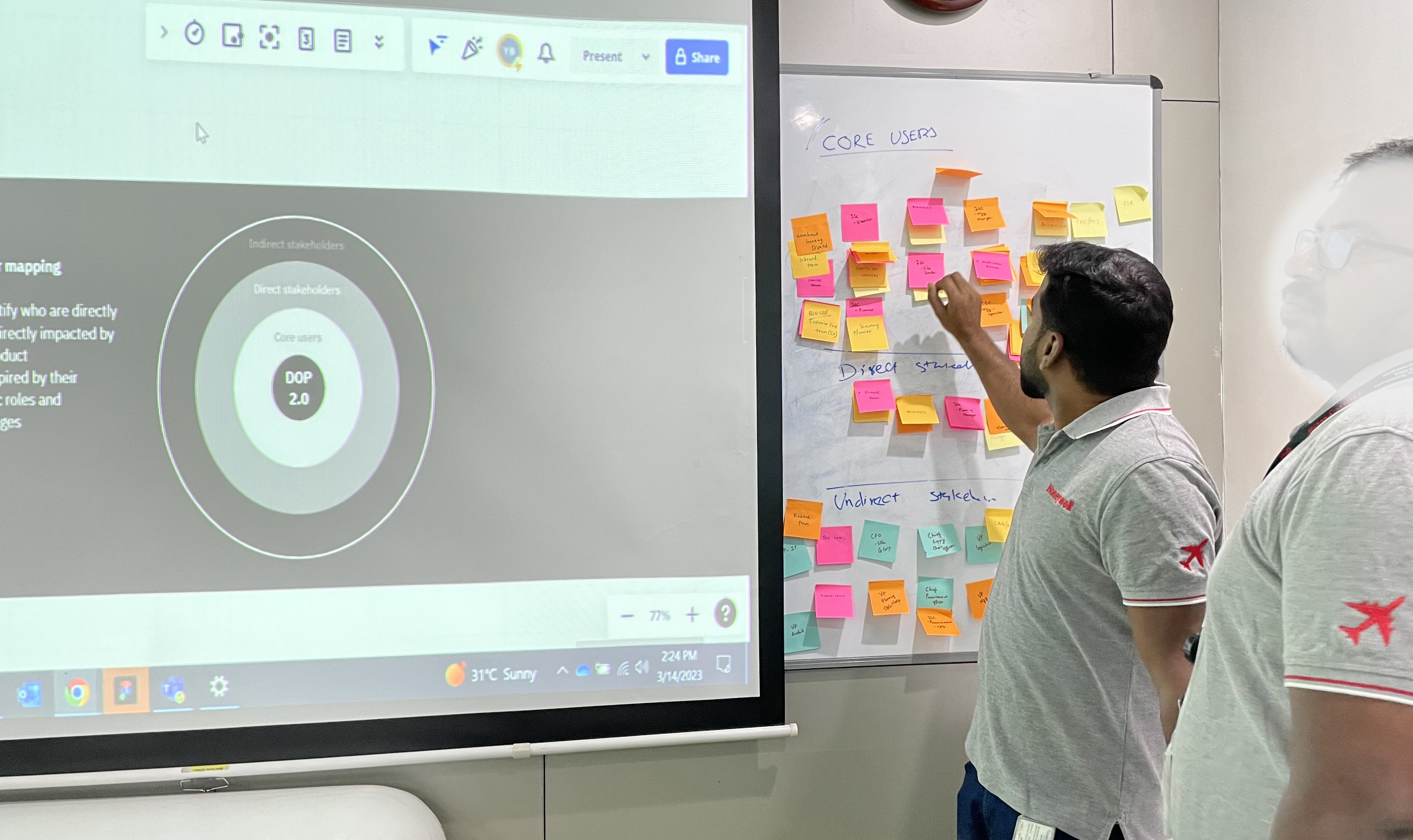
Stakeholder workshop — key stakeholders
Workshop session with key stakeholders during discovery
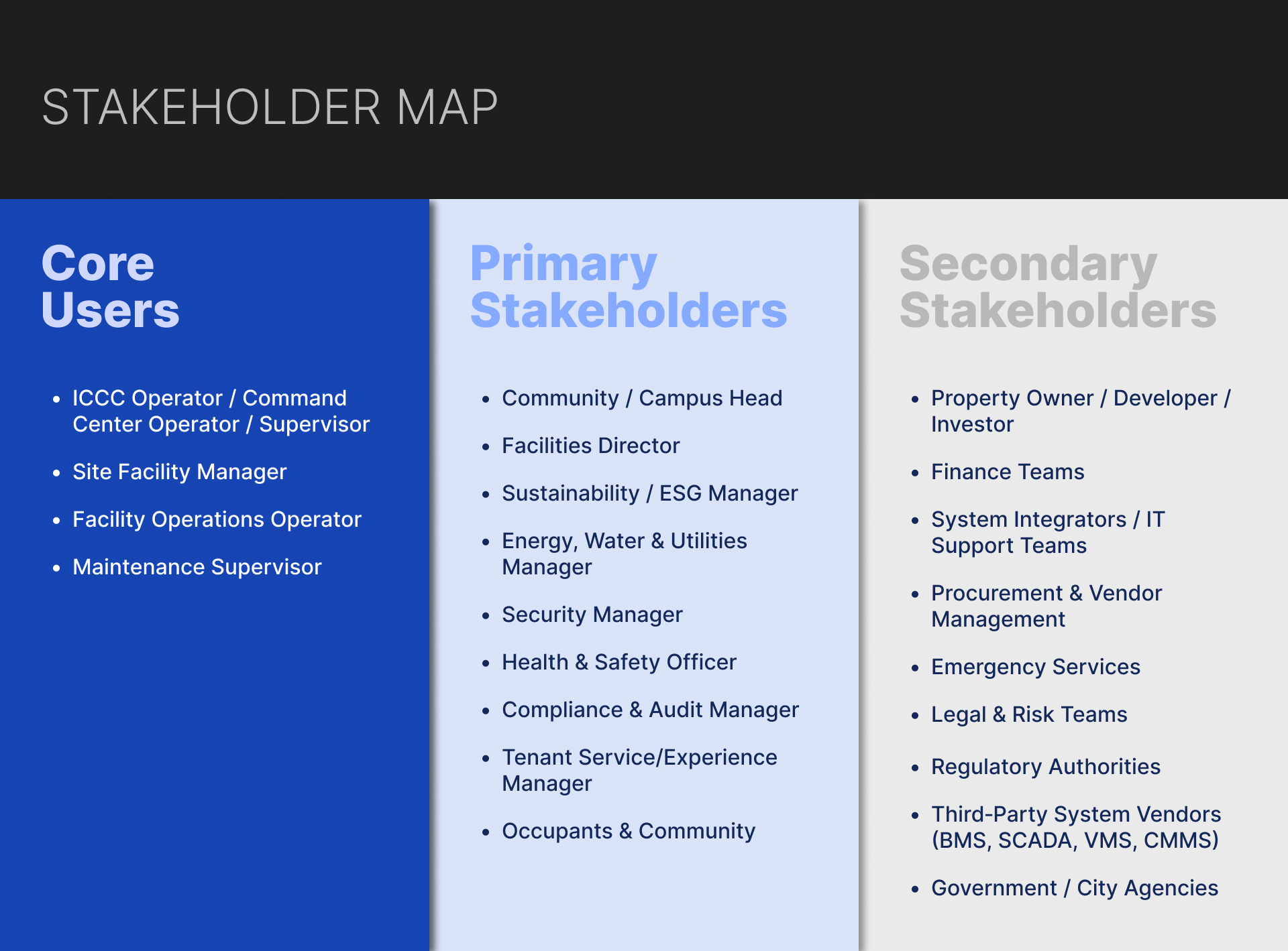
Stakeholder map artefact
Stakeholder mapping artefact synthesised from research
01
Command centres are much leaner
Ops teams at community-scale sites were leaner and more generalist than enterprise models assumed. Multi-screen, data-heavy interfaces weren't just impractical — they were a liability. Situational awareness at a glance, not after navigation.
02
Each subsystem was an island
An incident touching two systems required two separate investigations. Cross-domain pattern recognition was entirely dependent on individual operator experience. The core value wasn't replacement — it was integration.
03
Intelligence was buried and expensive
Operational reporting consumed 3–5 hours of weekly manual effort. Senior decision-makers were working from data already 48–72 hours stale when it reached them.
"I spend half my Monday pulling together a report my director looks at for four minutes."
— Operations Analyst, discovery interviewThree operational domains, one coherent system.
Rather than designing isolated features, we structured the platform around three distinct operational domains — each serving a different layer of the community, unified beneath shared workflow, intelligence, and integration layers.
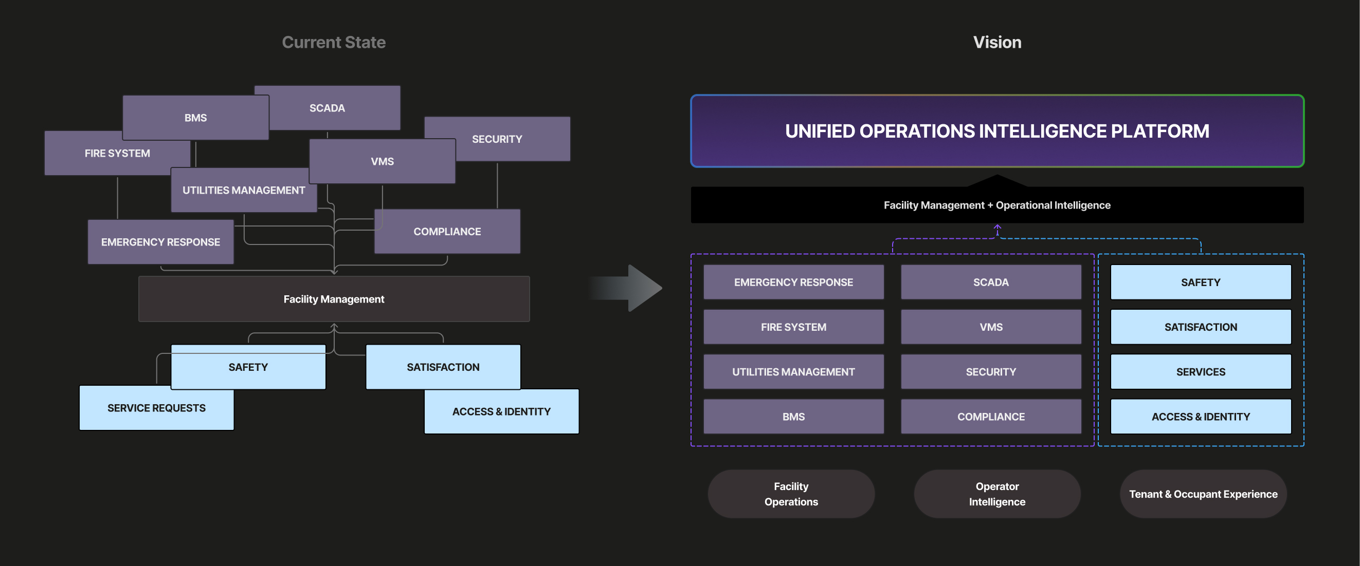
System architecture vision
High-level system architecture vision underpinning the three-domain model
Facility Operations
- Asset management & maintenance workflows
- IoT and BMS integration
- Energy monitoring
- Workforce coordination
- Alerting
Operator Intelligence
- Unified system health
- Cross-domain KPIs
- Anomaly detection
- AI-assisted reporting & ticket creation
Tenant & Occupant Experience
- Tenant onboarding
- Service requests
- Visitor management
- Community communications
- Amenity access
Interaction Layer — role-appropriate surfaces per persona
Workflow Layer — approvals, escalations, compliance logic
Intelligence Layer — KPI engines, anomaly detection, predictive models
Data & Integration — unified schema connecting BMS, ERP, CRM, and subsystems
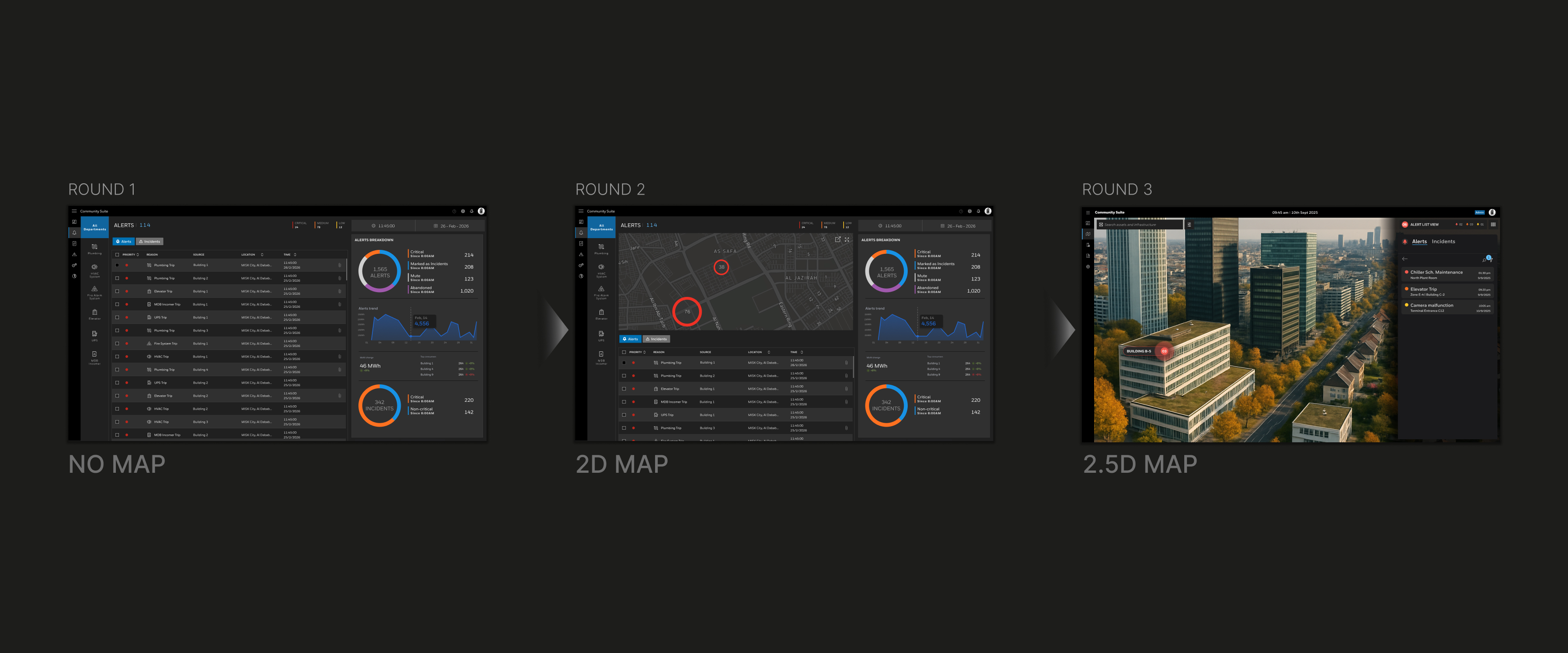
Interface evolution — Round 1 text-based alerts → Round 2 spatial map model
How the interface changed across testing rounds — from text-based alerts to a spatial, map-centric model
Starting hypothesis: could the existing City Suite be sufficiently simplified?
Three failure points emerged from structured prototype testing:
Operators struggled to locate incidents spatially using the text-based alert system.
The resolution workflow consumed the full screen, eliminating peripheral awareness at exactly the wrong moment.
The underlying cognitive model was mismatched — City Suite was built for inter-departmental alert management; community operators need more informal workflows with greater involvement in resolution.
The pivot: reorganise around a spatial model.
Alerts mapped to physical locations. A map view of the campus introduced as the primary navigation layer.
Operators built situational awareness faster and with noticeably more confidence than with the alert-driven model.
Operators consistently wanted site-wide visibility while resolving an incident — this drove the split-context layout.
Operators began repositioning and resizing panels unprompted — this became the brief for the composable dashboard system.
"As soon as I could see it on the map, I knew what I was dealing with. I didn't need to read anything."
— Facility Operations Manager, prototype test sessionMap-centric operator interface
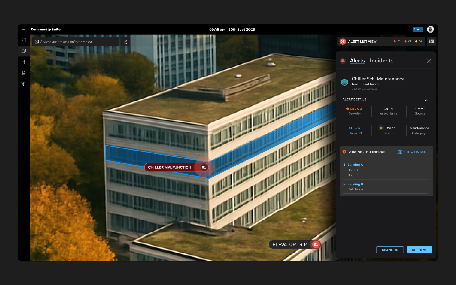
Final UI — 2.5D campus map with live incident overlay
2.5D operator view — spatial navigation with active incident overlay
Location as the primary navigation model — not system category. Operators locate incidents by where they are and dispatch by physical proximity.
A 2.5D god's-eye view was chosen over flat 2D and full 3D. Enough spatial depth for rapid orientation without performance overhead. Full 3D digital twin retained as an opt-in, partner-powered capability.
Operators using the spatial interface located incidents and navigated to relevant camera feeds measurably faster than those using textual alert details.
AI as an operational accelerator
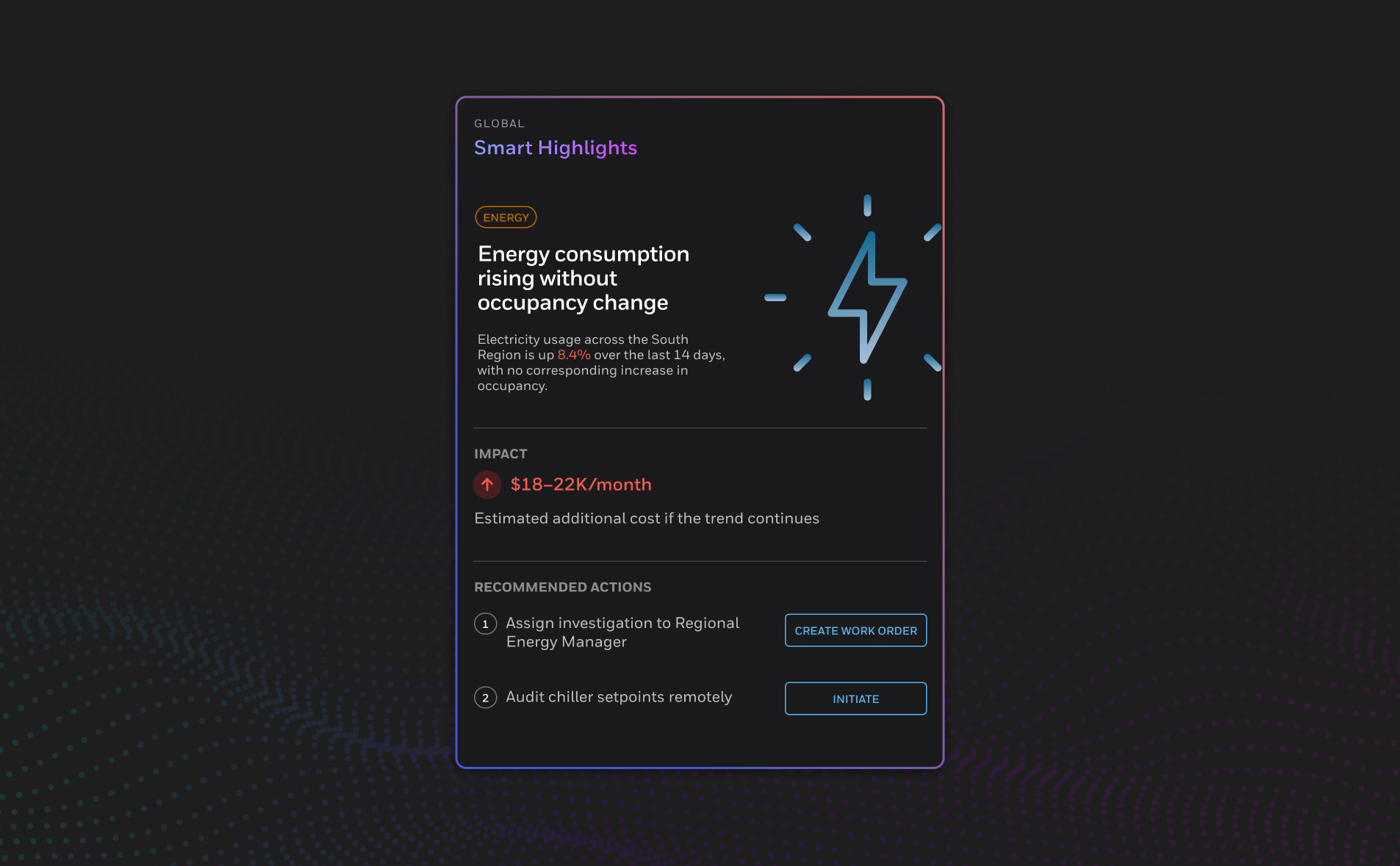
AI features — Smart Highlights panel, Incident Summary drawer, Work Order assistant
Smart Highlights view — cross-domain correlation callouts surfaced automatically
AI was scoped tightly against validated pain points — each replacing a documented manual bottleneck, not speculative capability.
Smart Highlights
Auto-surfaced cross-domain summaries, eliminating the 3–5 hour weekly manual reporting cycle.
Incident Summaries
Context-compiled briefs from sensor data, asset history, and prior work orders.
AI-Assisted Work Orders
Tickets pre-populated with asset history and likely fault type.
Composable dashboard design system
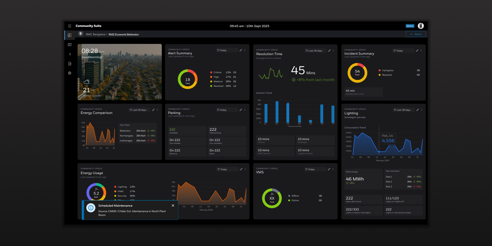
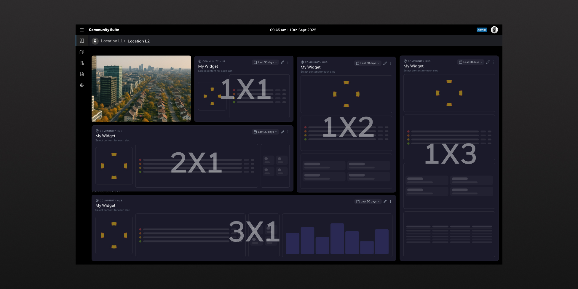
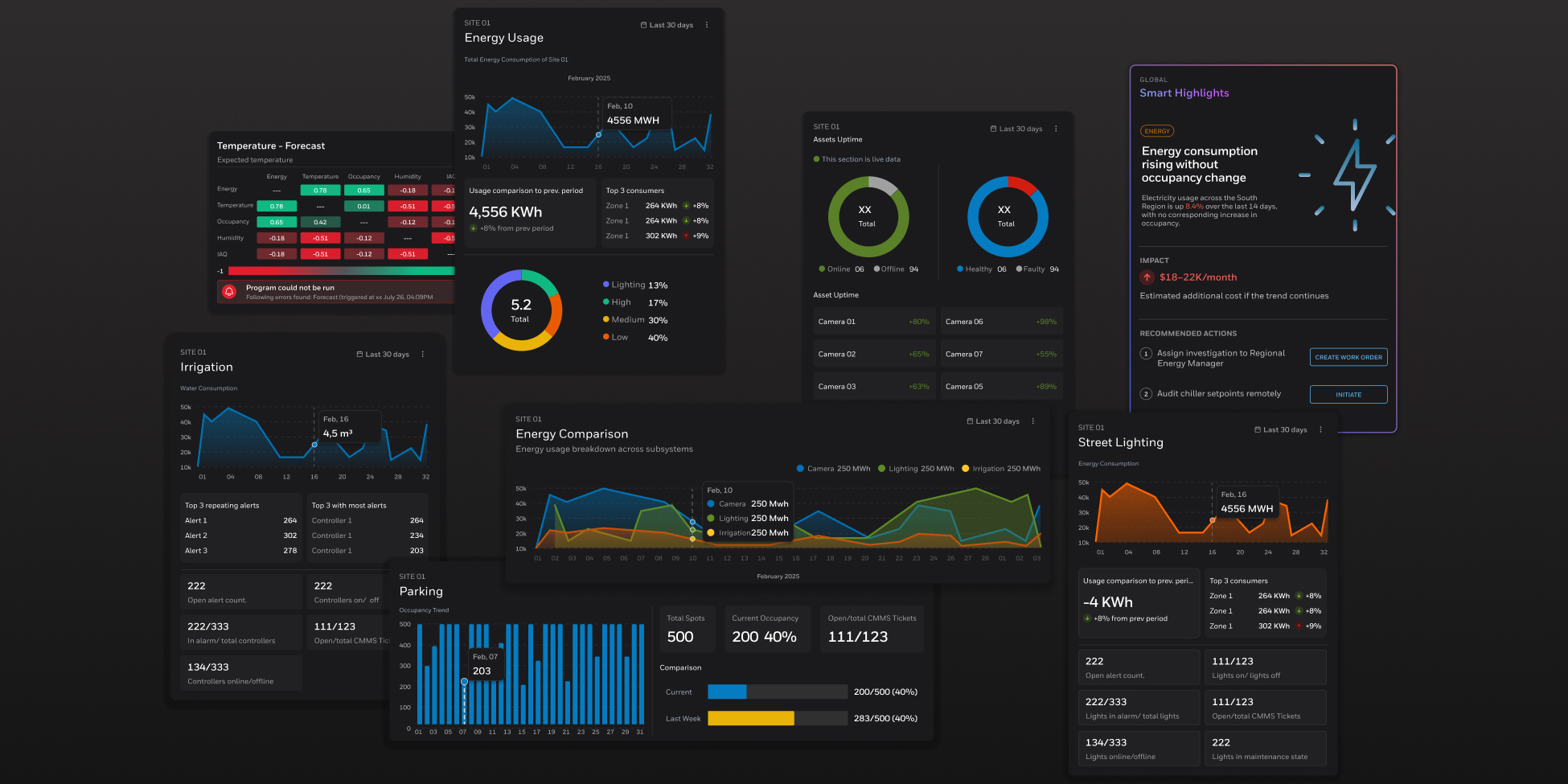
Research confirmed operators want to customise their workspace — reorder, resize, configure widgets to match their role and shift pattern.
Product and engineering wanted to solve this narrowly, per screen, for speed-to-ship. The resolution: a phased delivery — core widget set in release one, composable architecture in place to extend.
The design system now underpins every dashboard surface in the product.
Led a team of mid-level UX and UI designers
Identified and defined the community-scale segment as distinct from the existing city offering
Led research and interviews; synthesised findings into product & design rationale
Helped define solution architecture
Designed and ran formative testing studies
Led creation of the composable dashboard design system
Led IA, interaction design, and UX writing across all interfaces
Stakeholder management: product, engineering, and sales
Mentored mid-level designers through end-to-end delivery while remaining hands-on